
Description
SPECIFICATIONS
Brand Name: PDQ
Origin: Mainland China
About this item
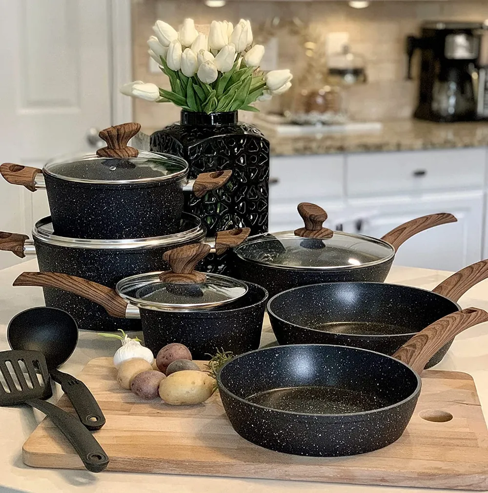
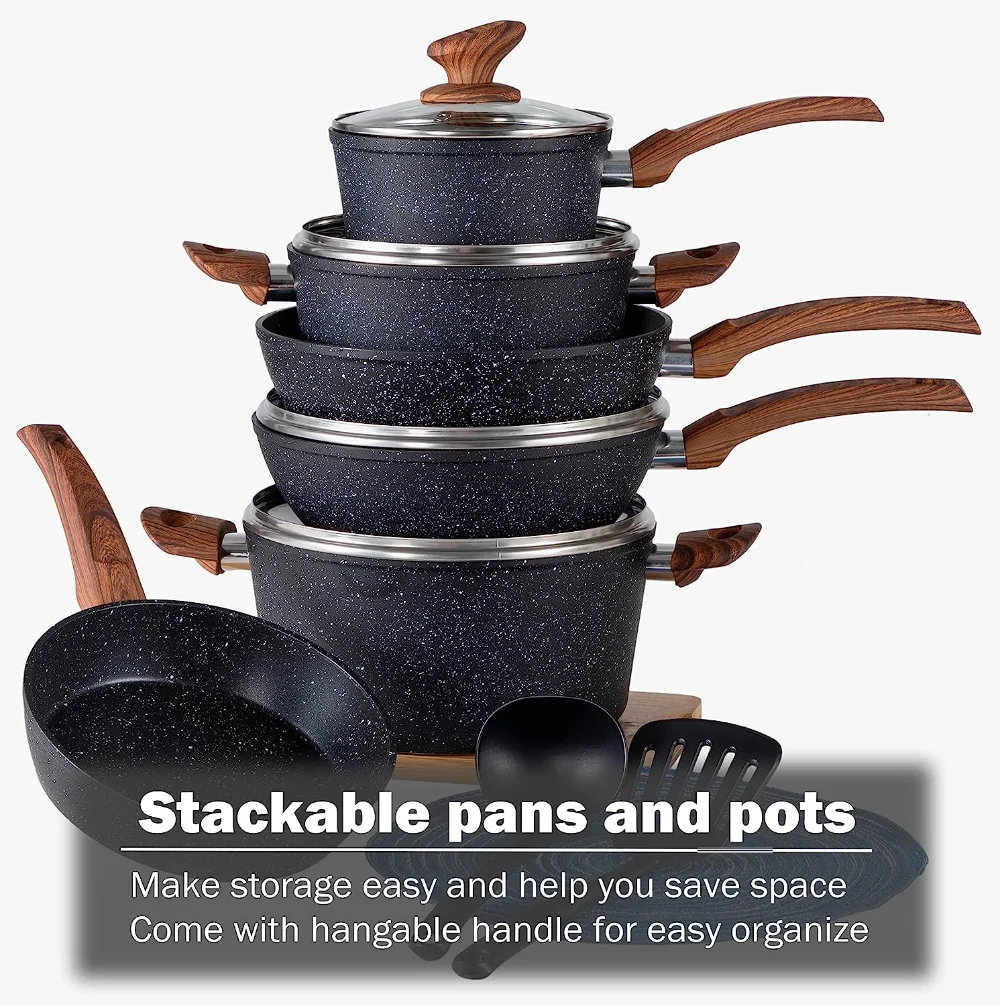
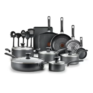
- Kitchen Cookware Set 12 piece – Include 8-inch fry pan / 11-inch fry pan / 9.7-inch Deep Fry Pan with lid / 1.5Q saucepan with lid / 3Q casserole with lid / 5Q casserole with lid / 2 pcs silicone utensils. The Interchangeable lid can be used for fry pan. Easy Clean & hand wash recommend!
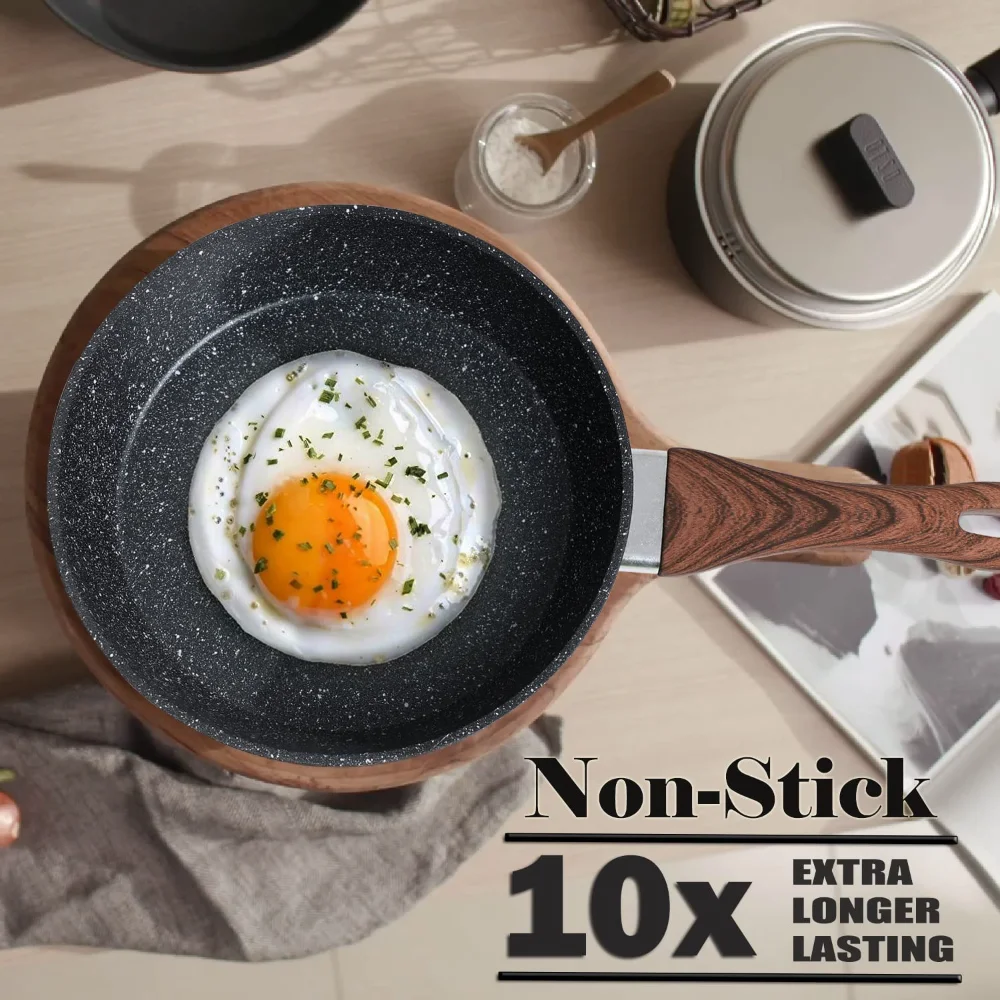
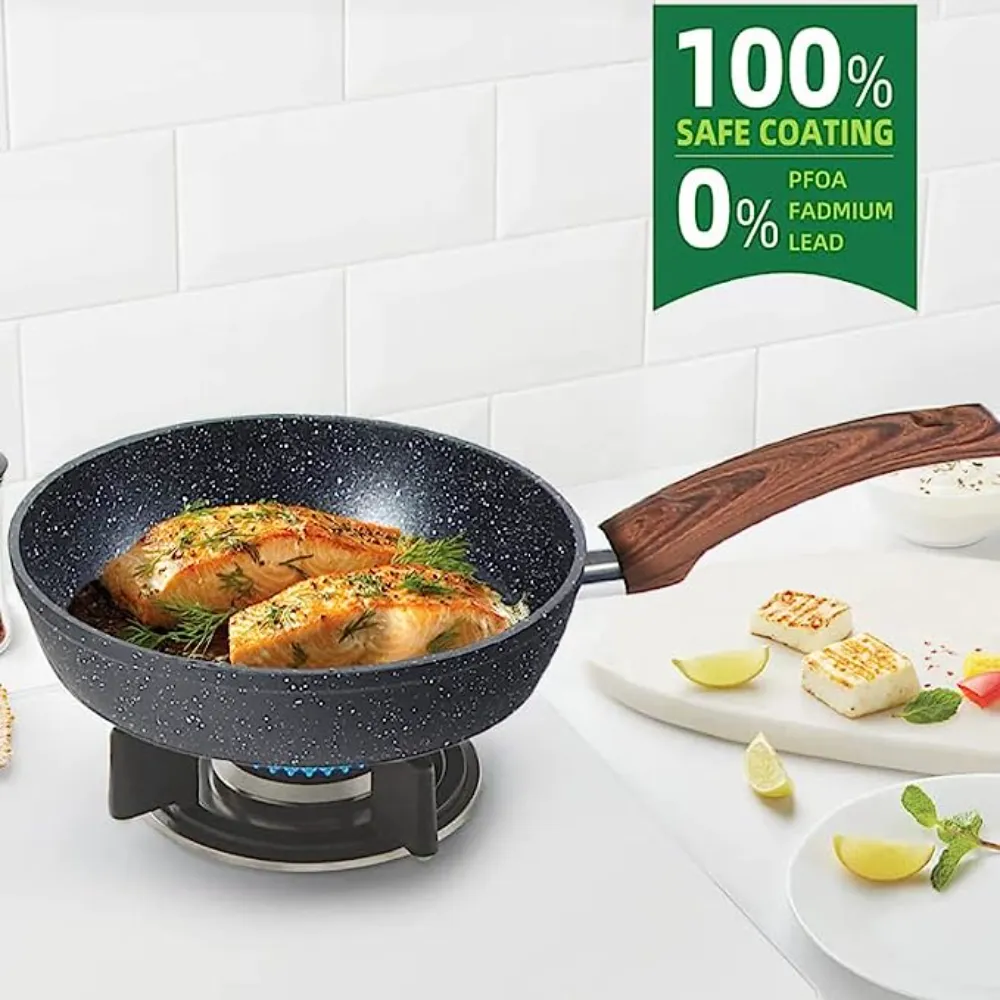
- Nonstick Pots and Pans Set – When buying cookware, one of the important things is nonstick capabilities. The graniteware coating do a good job in preventing food from sticking. Also, you’ll be able to cook healthier meals for your family since you won’t have to use as much oil. You can safely cook tomato sauce in granite cookware cookware, the taste and smell of your food will not change even if you use acidic or strong-smelling ingredients.
- Toxin-free Cooking Set – When buying a new set, make sure that it clearly indicates that it is lead, PFOS, PFOA-free. These are the three things that you don’t want to have in your cookware because of their potential health dangers. Fortunately, you can get granite cookware that are free of these harmful chemicals. For more healthy & Eco-freiendly.
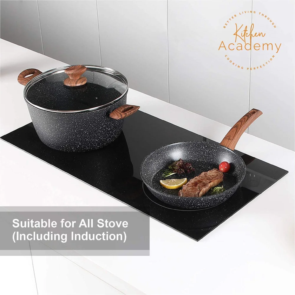
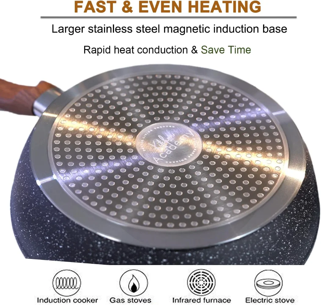
- Induction Cookware Sets – When it comes to the interior, this cookware uses an aluminum core. The result is that the pan heats up quickly, and more importantly, distributes heat evenly. The cookware set works on all major types of cooktops. Larger high magnetic conductive stainless steel base ensure induction compatible, especially glass stove
- Pots and Pans with Bakelite Handle – Bakelite is used because it has heat-resistant properties and is an electrical insulator. Bakelite would not burn when exposed to high heat. Bakelite is safe up to 350 degrees F, for a limited time. Dark bakelite handle is more stain-resistant and easy to clean too.
- Great Quality & Service – Quality first, Service Utmost. All cookware sets purchased have a 365 Days warranty as standard. If you meet any problems, don’t hesitate to contact our 24/7 online customer service which will reply to you ASAP to help with your worries.
Product information
| Material | Granite |
|---|---|
| Color | Black |
| Size | 12 PCS Cookware Set |
| Handle Material | Bakelite |
| Is Dishwasher Safe | Yes |
| Material Type Free | Pfos Free |
| Compatibility Options | Induction |
| Number of Pieces | 12 |
| Closure Material | Glass |
| Package Dimensions | 23.03 x 14.02 x 8.98 inches |
| Item Weight | 18.41 pounds |
.aplus-v2 .premium-aplus-module-2 .premium-background-wrapper {
position: relative;
}
.aplus-v2 .premium-aplus-module-2 .premium-intro-wrapper {
position: absolute;
width: 50%;
height: 100%;
top: 0;
}
.aplus-v2 .premium-aplus-module-2 .premium-intro-wrapper.right {
left: 50%;
}
html[dir=”rtl”] .aplus-v2 .premium-aplus-module-2 .premium-intro-wrapper.right {
left: auto;
right: 50%;
}
.aplus-v2 .premium-aplus-module-2 .premium-intro-wrapper.secondary-color {
color: #fff;
}
.aplus-v2 .premium-aplus-module-2 .premium-intro-background {
padding: 20px;
}
.aplus-v2 .premium-aplus-module-2 .aplus-module-2-topic {
padding-bottom: 10px;
}
.aplus-v2 .premium-aplus-module-2 .aplus-module-2-heading {
padding-bottom: 20px;
}
.aplus-v2 .premium-aplus-module-2 .aplus-module-2-description {
line-height: 1.5em;
}
.aplus-v2 .premium-aplus-module-2 .premium-intro-background.white-background {
background: rgba(255,255,255,0.5);
}
.aplus-v2 .premium-aplus-module-2 .premium-intro-background.black-background {
background: rgba(0,0,0,0.5);
}
.aplus-v2 .premium-aplus-module-2 .premium-intro-background.black-background,
.aplus-v2 .premium-aplus-module-2 .premium-intro-background.black-background h1,
.aplus-v2 .premium-aplus-module-2 .premium-intro-background.black-background h5,
.aplus-v2 .premium-aplus-module-2 .premium-intro-background.black-background ol,
.aplus-v2 .premium-aplus-module-2 .premium-intro-background.black-background ul,
.aplus-v2 .premium-aplus-module-2 .premium-intro-background.black-background ol .a-list-item,
.aplus-v2 .premium-aplus-module-2 .premium-intro-background.black-background ul .a-list-item {
color: #fff;
}
.aplus-v2 .premium-aplus-module-2 .premium-intro-content-container {
display: table;
height: 100%;
}
.aplus-v2 .premium-aplus-module-2 .premium-intro-wrapper.left .premium-intro-content-container {
padding-left: 40px;
}
html[dir=”rtl”] .aplus-v2 .premium-aplus-module-2 .premium-intro-wrapper.left .premium-intro-content-container {
padding-left: 0px;
padding-right: 40px;
}
.aplus-v2 .premium-aplus-module-2 .premium-intro-wrapper.right .premium-intro-content-container {
padding-right: 40px;
}
html[dir=”rtl”] .aplus-v2 .premium-aplus-module-2 .premium-intro-wrapper.right .premium-intro-content-container {
padding-right: 0px;
padding-left: 40px;
}
.aplus-v2 .premium-aplus-module-2 .premium-intro-content-column {
display: table-cell;
vertical-align: middle;
}
/**
* Premium modules global styles
*/
.aplus-v2.desktop {
max-width: 1464px;
min-width: 800px;
margin-left: auto;
margin-right: auto;
word-wrap: break-word;
overflow-wrap: break-word;
word-break: break-word;
}
/* Undo this for tech-specs because it breaks table layout */
.aplus-v2.desktop .premium-aplus .aplus-tech-spec-table { word-break: initial; }
.aplus-v2 .premium-aplus,
.aplus-v2 .premium-aplus .aplus-h1,
.aplus-v2 .premium-aplus .aplus-h2,
.aplus-v2 .premium-aplus .aplus-p1,
.aplus-v2 .premium-aplus .aplus-p2,
.aplus-v2 .premium-aplus .aplus-p3,
.aplus-v2 .premium-aplus .aplus-accent1,
.aplus-v2 .premium-aplus .aplus-accent2
{ font-family: Arial, sans-serif; }
.aplus-v2 .premium-aplus,
.aplus-v2 .premium-aplus .aplus-h1,
.aplus-v2 .premium-aplus .aplus-h2,
.aplus-v2 .premium-aplus .aplus-p1,
.aplus-v2 .premium-aplus .aplus-p2,
.aplus-v2 .premium-aplus .aplus-p3,
.aplus-v2 .premium-aplus .aplus-accent1,
.aplus-v2 .premium-aplus .aplus-accent2
{ font-family: inherit; }
/* type */
.aplus-v2 .premium-aplus .aplus-h1 { font-size: 32px; line-height: 1.2em; font-weight: 500; }
.aplus-v2 .premium-aplus .aplus-h2 { font-size: 26px; line-height: 1.25em; font-weight: 500; }
.aplus-v2 .premium-aplus .aplus-h3 { font-size: 18px; line-height: 1.25em; font-weight: 500; }
.aplus-v2 .premium-aplus .aplus-p1 { font-size: 20px; line-height: 1.3em; font-weight: 300; }
.aplus-v2 .premium-aplus .aplus-p2 { font-size: 16px; line-height: 1.4em; font-weight: 300; }
.aplus-v2 .premium-aplus .aplus-p3 { font-size: 14px; line-height: 1.4em; font-weight: 300; }
.aplus-v2 .premium-aplus .aplus-accent1 { font-size: 16px; line-height: 1.4em; font-weight: 600; }
.aplus-v2 .premium-aplus .aplus-accent2 { font-size: 14px; line-height: 1.4em; font-weight: 600; }
/* spacing */
.aplus-v2 .aplus-container-1 { padding: 40px; }
.aplus-v2 .aplus-container-1-2 { padding: 40px 80px; }
.aplus-v2 .aplus-container-2 { padding: 80px; }
.aplus-v2 .aplus-container-3 { padding: 40px 0; }
/* Display */
.aplus-v2 .premium-aplus .aplus-display-table { display: table; }
.aplus-v2 .premium-aplus .aplus-display-table-cell { display: table-cell; }
.aplus-v2 .premium-aplus .aplus-display-inline-block { display: inline-block; }
/* Aplus display table with min-width 1000px and fill remaining space inside parent */
.aplus-v2.desktop .premium-aplus .aplus-display-table-width { min-width: 1000px; width: 100% }
/**
* Padding and margin for element should be 10, 20, 40, or 80 px. Considering mini 10, small 20, medium 40, large 80.
*/
/**
* Premium-module 14: Carousel
*/
.aplus-v2 .premium-aplus-module-14 .aplus-carousel-container {
position: relative;
}
.aplus-v2 .premium-aplus-module-14 .aplus-carousel-element {
position: relative;
width: 100%;
}
.aplus-v2 .premium-aplus-module-14 .aplus-pagination-wrapper {
position: absolute;
top: 92%;
width: 100%;
}
.aplus-v2 .premium-aplus-module-14 .text-panel-container {
vertical-align: middle;
text-align: left;
width: 50%;
}
html[dir=”rtl”] .aplus-v2 .premium-aplus-module-14 .text-panel-container {
text-align: right;
}
.aplus-v2 .premium-aplus-module-14 .media-placeholder {
padding-bottom: 75%; /* Aspect ratio 4:3 for video and image */
}
.aplus-v2 .premium-aplus-module-14 .media-container {
position: absolute;
top: 0;
width: 50%;
height: 100%;
padding-bottom: 5%;
}
.aplus-v2 .premium-aplus.premium-aplus-module-14 .title {
padding-bottom: 20px;
}
.aplus-v2 .premium-aplus-module-14 .a-carousel-left {
margin-top: 17%;
}
.aplus-v2 .premium-aplus-module-14 .a-carousel-right {
margin-top: 17%;
}
.aplus-v2 .premium-aplus-module-14 .a-carousel-col {
height: 10%;
}
/**
* Premium-module 13: Carousel
*/
.aplus-v2 .premium-aplus-module-13 .aplus-carousel-container {
position: relative;
}
.aplus-v2 .premium-aplus-module-13 .aplus-carousel-element {
position: relative;
width: 100%;
}
.aplus-v2 .premium-aplus-module-13 .aplus-card-description-wrapper {
position: absolute;
top: 0;
left: 0;
width: 100%;
height: 100%;
}
.aplus-v2 .premium-aplus-module-13 .aplus-card-description {
display: table;
width: 50%;
height: 100%;
color: #fff;
}
.aplus-v2 .premium-aplus-module-13 .aplus-card-table-cell {
display: table-cell;
vertical-align: middle;
text-align: left;
}
html[dir=”rtl”] .aplus-v2 .premium-aplus-module-13 .aplus-card-table-cell {
text-align: right;
}
.aplus-v2 .premium-aplus-module-13 .aplus-text-background {
background: rgba(0, 0, 0, 0.5);
}
.aplus-v2 .premium-aplus-module-13 .aplus-text-background,
.aplus-v2 .premium-aplus-module-13 .aplus-text-background h1,
.aplus-v2 .premium-aplus-module-13 .aplus-text-background h5,
.aplus-v2 .premium-aplus-module-13 .aplus-text-background ol,
.aplus-v2 .premium-aplus-module-13 .aplus-text-background ul,
.aplus-v2 .premium-aplus-module-13 .aplus-text-background ol .a-list-item,
.aplus-v2 .premium-aplus-module-13 .aplus-text-background ul .a-list-item {
color: #fff;
}
.aplus-v2 .premium-aplus-module-13 .aplus-card-body {
padding: 20px 40px 0 0;
}
html[dir=”rtl”] .aplus-v2 .premium-aplus-module-13 .aplus-card-body {
padding: 20px 0 0 40px;
}
.aplus-v2 .premium-aplus-module-13 .aplus-card-link-button {
text-align: center;
padding-top: 20px;
}
.aplus-v2 .premium-aplus-module-13 .aplus-pagination-wrapper {
position: absolute;
top: 92%;
width: 100%;
}
/**
* Premium-module 8: Hero Video module
*/
.aplus-v2 .premium-aplus-module-8 .premium-aplus-module-8-video {
position: relative;
width: 100%;
}
.aplus-v2 .premium-aplus-module-8 .video-placeholder {
padding-bottom: 40.984%; /* Video or image required size 1464 : 600 = 40.9836 */
}
.aplus-v2 .premium-aplus-module-8 .video-container {
position: absolute;
top: 0;
width: 100%;
height: 100%;
}
/*Override the default VSE video player size*/
.aplus-v2 .premium-aplus-module-8 .video-js.vjs-fluid {
padding: 0;
}
.aplus-mantle.aplus-module .aplus-pagination-dots {
margin: 0;
}
.aplus-mantle.aplus-module .aplus-pagination-dot {
display: inline-block;
list-style: none;
}
.aplus-mantle.aplus-module .aplus-carousel-nav {
text-align:center;
}
.aplus-mantle.aplus-module .carousel-slider-circle {
display: inline-block;
cursor: pointer;
height: 15px;
width: 15px;
border: 1px solid #000;
border-radius: 20px;
background-color: #fff;
margin-left: 5px;
}
.aplus-mantle.aplus-module .carousel-slider-circle.aplus-carousel-active {
background-color: #FFA500;
}
/*
* Used when device = desktop
* Configured in: configuration/brazil-config/global/brand-story.cfg
*/
/* Because the carousel is implemented as an ol list,
any lists in the card text will have a secondary list style (letters).
This will give an incorrect appearance to viewers,
so we set all lists to the primary list style (numbers). */
.aplus-brand-story-card ol li {
list-style: decimal;
}
/* Top level containers */
.aplus-module .apm-brand-story-hero {
-moz-box-sizing: border-box;
-webkit-box-sizing: border-box;
box-sizing: border-box;
width: 1464px;
height: 625px;
background-color: #fff;
}
.aplus-module .apm-brand-story-card {
-moz-box-sizing: border-box;
-webkit-box-sizing: border-box;
box-sizing: border-box;
width: 362px;
height: 453px;
background-color: #fff;
}
.apm-brand-story-hero,
.apm-brand-story-card {
-moz-box-sizing: border-box;
-webkit-box-sizing: border-box;
box-sizing: border-box;
position: relative;
width: 100%;
height: 100%;
float: none;
}
.aplus-module.brand-story-card-1-four-asin .apm-brand-story-card {
/* Only 12px to account for image cell border */
padding: 12px;
}
/* Full background image (Hero 1 & Card 2) */
.aplus-module .apm-brand-story-background-image {
-moz-box-sizing: border-box;
-webkit-box-sizing: border-box;
box-sizing: border-box;
overflow: hidden;
position: absolute;
width: 100%;
height: 100%;
}
/* Card 1 small images */
.aplus-module .apm-brand-story-image-row {
-moz-box-sizing: border-box;
-webkit-box-sizing: border-box;
box-sizing: border-box;
height: 185px;
padding: 0px;
margin: auto;
display: flex;
}
.aplus-module .apm-brand-story-image-row .apm-brand-story-image-cell {
/* Use content-box to ensure image size matches editor schema */
-moz-box-sizing: content-box;
-webkit-box-sizing: content-box;
box-sizing: content-box;
padding: 0px;
margin: 0px;
width: 166px;
border: 1px solid #fff;
}
.aplus-module .apm-brand-story-image-row .apm-brand-story-image-cell .apm-brand-story-image-link {
display: block;
width: 100%;
height: 100%;
}
.aplus-module .apm-brand-story-image-row .apm-brand-story-image-cell .apm-brand-story-image-link .apm-brand-story-image-img {
display: block;
width: 100%;
height: 100%;
object-fit: cover;
}
/* Card 3 logo image */
.aplus-module .apm-brand-story-logo-image {
-moz-box-sizing: content-box;
-webkit-box-sizing: content-box;
box-sizing: content-box;
height: 145px;
margin: 0px 4px;
padding: 20px;
padding-bottom: 0px;
}
/* Text overlays */
.aplus-module .apm-brand-story-text-bottom {
-moz-box-sizing: border-box;
-webkit-box-sizing: border-box;
box-sizing: border-box;
position: absolute;
bottom: 13px;
left: 13px;
}
.aplus-module .apm-brand-story-hero .apm-brand-story-text-bottom {
background-color: rgba(0,0,0,0.6);
color: #fff;
padding: 13px 65px 13px 13px; /* accounts for overlap of first card */
width: 437px;
}
.aplus-module.brand-story-card-2-media-asset .apm-brand-story-text-bottom {
background-color: rgba(255,255,255,0.6);
color: #000;
padding: 13px;
width: 336px;
}
.aplus-module.brand-story-card-1-four-asin .apm-brand-story-text {
margin-top: 8px;
}
.aplus-module.brand-story-card-1-four-asin .apm-brand-story-text.apm-brand-story-text-single {
margin-top: 20px;
}
.aplus-module.brand-story-card-1-four-asin .apm-brand-story-text h3 {
white-space: nowrap;
overflow: hidden;
text-overflow: ellipsis;
}
.aplus-module .apm-brand-story-slogan-text {
-moz-box-sizing: content-box;
-webkit-box-sizing: content-box;
box-sizing: content-box;
margin: 0px 4px;
padding: 20px;
}
.aplus-module .apm-brand-story-faq {
-moz-box-sizing: content-box;
-webkit-box-sizing: content-box;
box-sizing: content-box;
padding-top: 10px;
}
.aplus-module .apm-brand-story-faq-block {
margin: 0px 10px;
padding: 10px;
}
.aplus-v2 .apm-brand-story-carousel-container {
position: relative;
}
.aplus-v2 .apm-brand-story-carousel-hero-container,
.aplus-v2 .apm-brand-story-carousel-hero-container > div {
position: absolute;
width: 100%;
}
/*
Ensuring the carousel takes only the space it needs.
The sizes need to be set again on the absolutely positioned elements so they can take up space.
*/
.aplus-v2 .apm-brand-story-carousel-container,
.aplus-v2 .apm-brand-story-carousel-hero-container {
height: 625px;
width: calc(100% + 15px);
max-width: 1464px;
margin-left: auto;
margin-right: auto;
}
/*
This centers the carousel vertically on top of the hero image container and after the logo area (125px).
Margin-top = (heroHeight – cardHeight – logoAreaHeight) / 2 + logoAreaHeight
*/
.aplus-v2 .apm-brand-story-carousel .a-carousel-row-inner{
margin-top: 149px;
}
/*
Cards need to have a width set, otherwise they default to 50px or so.
All cards must have the same width. The carousel will resize itself so all cards take the width of the largest card.
The left margin is for leaving a space between each card.
*/
.aplus-v2 .apm-brand-story-carousel .a-carousel-card {
width: 362px;
margin-left: 30px !important;
}
/* styling the navigation buttons so they are taller, flush with the sides, and have a clean white background */
.aplus-v2 .apm-brand-story-carousel .a-carousel-col.a-carousel-left,
.aplus-v2 .apm-brand-story-carousel .a-carousel-col.a-carousel-right {
padding: 0px;
}
.aplus-v2 .apm-brand-story-carousel .a-carousel-col.a-carousel-left .a-button-image,
.aplus-v2 .apm-brand-story-carousel .a-carousel-col.a-carousel-right .a-button-image {
border: none;
margin: 0px;
}
.aplus-v2 .apm-brand-story-carousel .a-carousel-col.a-carousel-left .a-button-image .a-button-inner,
.aplus-v2 .apm-brand-story-carousel .a-carousel-col.a-carousel-right .a-button-image .a-button-inner {
background: #fff;
padding: 20px 6px;
}
.aplus-v2 .apm-brand-story-carousel .a-carousel-col.a-carousel-left .a-button-image .a-button-inner {
border-radius: 0px 4px 4px 0px;
}
.aplus-v2 .apm-brand-story-carousel .a-carousel-col.a-carousel-right .a-button-image .a-button-inner {
border-radius: 4px 0px 0px 4px;
}
Reviews
There are no reviews yet.